Composition Editor: an Introduction
The composition editor is so central to constructing applications with parts that a brief orientation as to its appearance and constituent parts is in order so that when you actually use it, you will be familiar with its appearance and the use of its components.
When creating or modifying a part, you open the Composition Editor for that part. The Composition Editor is made up of several components: the parts palette along the left side, the status area along the bottom left, the tool bar along the top, the free-form surface where you layout the part and subparts, and the visual tool symbols at the bottom right corner.
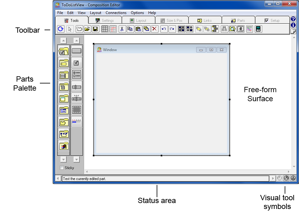
The Composition Editor depicted above includes the VA Assist Pro extensions. The shipped image includes these extensions. If your Composition Editor does not look like the picture, enable VA Assist from the Transcript using Tools>VA Assist Pro>Enable
You use the Composition Editor to construct new parts. These new parts can contain other parts as well as connections between parts. You can think of the parts you construct in the Composition Editor as composite parts, because they contain other parts. While you can use the Composition Editor to construct various types of composite parts, you mainly use it to construct composite visual parts. The composite parts you build make up your application.

Until you learn to identify all of the tool bar and palette icons by sight you can always rely on hover help to assist you. To display hover help for a tool bar or part palette item just position your mouse pointer over the icon you are interested in. Hover help will display a brief description for several seconds and then turn itself off.
Parts palette
The parts palette, which is located on the left side of the Composition Editor, contains the set of ready made parts you use most frequently. The parts palette organizes the parts into categories.
The categories are in the left column of the parts palette, and the parts in the selected category are in the right column.
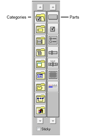

The Status area at the bottom of the Composition Editor indicates the category and part currently selected in the parts palette, or the part or connection currently selected on the free-form surface.
For more information about the individual parts, refer to VA Smalltalk user interface parts. Also, refer to the Visual Parts Reference and the Basic Help.
Tool bar
The tool bar, which is located below the menu bar of the Composition Editor, provides easy access to the tools commonly used while laying out parts. These tools help with such tasks as part alignment and sizing, showing and hiding connections between parts, and testing your application.
With VA AssistPro extensions, the toolbar is tabbed. Rather than exhaustively going through the tool chest, the following images highlight tools which you will need in constructing your first parts.
Most of the tools in the tool bar act on selected parts. If no parts are selected for a tool to act on, the tool is disabled.
For more information about the individual tools, refer to Basic Help.
General tools

Note:
The File, Layout and Edit pull-down menus also provide access to these tools.
 The Test tool opens the part being edited in the CompositionEditor.
 The Selection tool allows the user to indicate which parts to alter or examine.
 The Add tool creates a new part.
 This grid tool controls whether a grid is shown.
 This grid tool aligns selected parts to the grid.
  The Properties tool opens the setting view for the selected part(s).
Size and position Tools

Note:
The Layout pull-down menu also provides access to these tools.
Alignment tools  work with selected parts (left to right) align on left side, center horizontally, align on right side; align on top, center vertically, align on bottom.
 work with selected parts (left to right) align on left side, center horizontally, align on right side; align on top, center vertically, align on bottom.
 Distribution tools  work with selected parts (left to right) distribute horizontally distribute vertically.
 work with selected parts (left to right) distribute horizontally distribute vertically.
 The grid tools toggle grid visibility ( ) and selected part(s) to the grid (
 ).
).
 ) and selected part(s) to the grid (
 ).
).Connection tools

Note:
The Connections pull-down menu also provides access to these tools.
 connect parts using their features (attributes, actions and events)
Basic toolbar
Note:
The image of the toolbar below depicts the toolbar without the VA Assist Pro Extensions.

Note:
The Tools pull-down menu also provides access to these tools.
Free-form surface
The large open area in the Composition Editor is called the free-form surface. You use the free-form surface as the visual programming area where you construct the parts of your application.
When you create a new visual part, the free-form surface contains a Window part by default. You can add other visual parts, such as entry fields and push buttons, to this Window part. If you are creating a nonvisual part, the free-form surface does not contain an initial default part.
Although you can add both visual and nonvisual parts to the free-form surface, you typically only add visual parts inside other visual parts such as windows. You can add nonvisual parts only to the free-form surface.
Regardless of the type of part, every part has a pop-up menu that contains options you can use to modify or work with that part. Each part has its own pop-up menu that can be accessed from any open area on the surface of the part.
Visual tool symbols
The visual tool symbols, which are located in the bottom right corner of the Composition Editor, are used to switch between the three editors for the part you are currently editing. They are in the same location in the Script Editor and Public Interface Editor too.
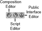

Status Bar
The status bar at the bottom of the Composition Editor will give you additional textual information which will indicate what part is selected or other helpful information about what is happening on the free form surface.
Last modified date: 02/17/2021