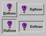
check
Set the receiver's state to checked (true).
Set the receiver's state to checked (true).
click
Programatically click the button.
Programatically click the button.
drawPolicy: anInteger
Specifies the drawing policy used in rendering buttons. The drawing policy determines two things for a button:
Specifies the drawing policy used in rendering buttons. The drawing policy determines two things for a button:
getState
Answer the state of the checkbox.
Answer the state of the checkbox.
labelCheckedPixmap: anImage
Specifies the renderable object (pixmap) which draws on the face of the widget when it is checked.
Specifies the renderable object (pixmap) which draws on the face of the widget when it is checked.
labelCheckedString: aString
Specifies the renderable object (string) which draws on the face of the widget when it is checked.
Specifies the renderable object (string) which draws on the face of the widget when it is checked.
labelInsensitivePixmap: anImage
Specifies the renderable object (image) which draws on the face of the widget when it is disabled.
Specifies the renderable object (image) which draws on the face of the widget when it is disabled.
labelInsensitiveString: aString
Specifies the renderable object (string) which draws on the face of the widget when it is disabled.
Specifies the renderable object (string) which draws on the face of the widget when it is disabled.
labelPressedPixmap: anImage
Specifies the renderable object (image) which draws on the face of the widget when it is pressed.
Specifies the renderable object (image) which draws on the face of the widget when it is pressed.
labelPressedString: aString
Specifies the renderable object (string) which draws on the face of the widget when it is pressed.
Specifies the renderable object (string) which draws on the face of the widget when it is pressed.
orientation: anInteger
Specifies whether the image and label are displayed vertically or horizontally.
Specifies whether the image and label are displayed vertically or horizontally.
set: aBoolean
Displays the button in its selected state if set to true.
Displays the button in its selected state if set to true.
setState: newState notify: notify
Sets or changes the EwToggleButton's current state.
newState - Specifies a Boolean value that indicates whether the checkbox state is selected or unselected. If true, the button state is selected; if false, button state is unselected. notify - Indicates whether valueChangedCallback is it can be either true or false.
showAsDefault: anInteger
Specifies a shadow thickness for a second shadow to be drawn around the PushButton to visually mark it as a default button. When the resource is set to 0, the button appears as a normal button.
Specifies a shadow thickness for a second shadow to be drawn around the PushButton to visually mark it as a default button. When the resource is set to 0, the button appears as a normal button.
turnOff
Set the receiver's state to off (false).
Set the receiver's state to off (false).
turnOn
Set the receiver's state to on (true).
Set the receiver's state to on (true).
uncheck
Set the receiver's state to unchecked (false).
Set the receiver's state to unchecked (false).
Arm Callback
These callbacks are triggered when the button is armed. Buttons are armed and appear pressed whenever the moused is pressed within the button and not yet released. If the mouse is moved outside of the button while still pressed, the button will be disarmed and appear unpressed. If the mouse is released while still in the button, the button is activated
These callbacks are triggered when the button is armed. Buttons are armed and appear pressed whenever the moused is pressed within the button and not yet released. If the mouse is moved outside of the button while still pressed, the button will be disarmed and appear unpressed. If the mouse is released while still in the button, the button is activated
Default Action Callback
These callbacks are triggered when the widget is double clicked.
These callbacks are triggered when the widget is double clicked.
Disarm Callback
These callbacks are triggered when the button is disarmed. Buttons are disarmed whenever the mouse is moved outside of the button after it has been armed. Moving the mouse back over the button while the mouse button is still down will cause the button to become rearmed.
These callbacks are triggered when the button is disarmed. Buttons are disarmed whenever the mouse is moved outside of the button after it has been armed. Moving the mouse back over the button while the mouse button is still down will cause the button to become rearmed.
Value Changed Callback
These callbacks are triggered when the checkbox value is changed.
These callbacks are triggered when the checkbox value is changed.
Border Width
Specifies the width of the border that surrounds the widget’s window on all four sides. The width is specified in pixels. A width of zero means that no border will show.
Specifies the width of the border that surrounds the widget’s window on all four sides. The width is specified in pixels. A width of zero means that no border will show.
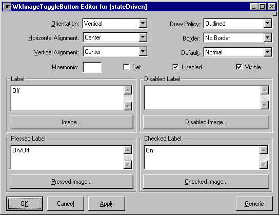
Draw Policy
Specifies the drawing policy used in rendering buttons. The drawing policy determines two things for a button:
Specifies the drawing policy used in rendering buttons. The drawing policy determines two things for a button:
Enabled
Determines whether a widget will react to input events. Disabled (insensitive) widgets do not react to input events.
Determines whether a widget will react to input events. Disabled (insensitive) widgets do not react to input events.
Horizontal Alignment
Specifies the horizontal alignment for the widget's image.
Specifies the horizontal alignment for the widget's image.
Label - Default
Specifies the default label string.
Specifies the default label string.
Label - Pressed
Specifies the label string when the widget is pressed.
Specifies the label string when the widget is pressed.
Label - Disabled
Specifies the label string when the widget is disabled.
Specifies the label string when the widget is disabled.
Label - Checked
Specifies the label string when the widget is checked.
Specifies the label string when the widget is checked.
Image - Default
Specifies the default label image.
Specifies the default label image.
Image - Pressed
Specifies the label image when the widget is pressed.
Specifies the label image when the widget is pressed.
Image - Disabled
Specifies the label image when the widget is disabled.
Specifies the label image when the widget is disabled.
Image - Checked
Specifies the label image when the widget is checked.
Specifies the label image when the widget is checked.
Mnemonic
Provides the user with alternate means for selecting a button.
Provides the user with alternate means for selecting a button.
Orientation
Specifies whether the image and label are displayed vertically or horizontally.
Specifies whether the image and label are displayed vertically or horizontally.
Set
Displays the button in its selected state if set to true.
Displays the button in its selected state if set to true.
Show As Default
Specifies a shadow thickness for a second shadow to be drawn around the PushButton to visually mark it as a default button. When the resource is set to 0, the button appears as a normal button.
Specifies a shadow thickness for a second shadow to be drawn around the PushButton to visually mark it as a default button. When the resource is set to 0, the button appears as a normal button.
Vertical Alignment
Specifies the vertical alignment for the widget's image.
Specifies the vertical alignment for the widget's image.
Visible
Maps the widget (makes visible) as soon as it is both realized and managed, if set to True. If set to False, the client is responsible for mapping and unmapping the widget.
Maps the widget (makes visible) as soon as it is both realized and managed, if set to True. If set to False, the client is responsible for mapping and unmapping the widget.


