Part Encyclopedia : WkValueSetView

WkValueSetView
C:\Users\documentation\Documents\vastePublisher\stable\VAS Documentation Word\images\wkctrl\vs-i.png
C:\Users\documentation\Documents\vastePublisher\stable\VAS Documentation Word\images\wkctrl\vs-ex.png
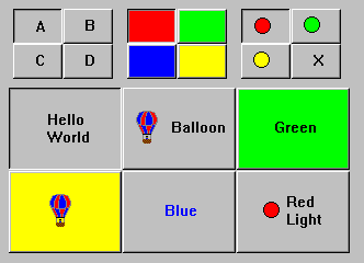
The WkValueSetView widget provides a means for selecting one item from a set of pictorial choices. It consists of a two-dimensional grid of graphical cells, where only one cell is selected at a time. ValueSets are very popular interface components, used for creating such GUI objects as tool bars, ribbons, paging buttons, and color choosers. Note that valuesets are useful in situations where one item is always selected from a group of choices. For applications where choosing an item will issue a command rather than make a selection, the WkImageButtonView classes should be used instead.
The user can select a particular item by clicking on it directly with the mouse, or using the arrow keys to move the selection. When an item is selected it notifies the single selection event.
Each cell may contain a label, an image and/or a color. To set the contents of a cell, the #cellAt:putXXX: protocols are provided. The object put into a cell can be an renderable object (e.g., an image, a String, or a Color).
Two methods are provided to retrieve the valueset’s selection: #itemPosition returns the point representing the column and row of the current selection, and #item returns the actual object in the selected cell.
Protocol
cellAt: aPoint putBackgroundColor: aString
Set the background color of the cell at the specified point.
 
cellAt: aPoint putForegroundColor: aString
Set the foreground color of the cell at the specified point.
 
cellAt: aPoint putImage: anImage
Set the image of the cell at the specified point.
 
cellAt: aPoint putLabel: aString
Set the label of the cell at the specified point.
 
cellBackgroundColorAt: aPoint
Answer the background color of the cell at the specified point.
 
cellForegroundColorAt: aPoint
Answer the foreground color of the cell at the specified point.
 
cellImageAt: aPoint
Answer the image of the cell at the specified point.
 
cellLabelAt: aPoint
Answer the label of the cell at the specified point.
drawPolicy: anInteger
Specifies the drawing policy used in rendering buttons on the valueset. The drawing policy determines two things for a button:
1.
2.
Default: XmSHADOWEDTHREESTATEDRAWPOLICY (Shadowed Three State)
Valid resource values:
XmSHADOWEDTWOSTATEDRAWPOLICY (Shadowed Two State) - Buttons are drawn with a 3D shadowed outline and exhibit a simple 2-state (OFF and ON) state rendering.
XmSHADOWEDTHREESTATEDRAWPOLICY (Shadowed Three State) - Buttons are drawn with a 3D shadowed outline and exhibit a 3-state (OFF, ON, and PRESSED) state rendering.
XmOUTLINEDRAWPOLICY (Outlined) - Buttons are drawn with a simple etched (non-shadowed) outline and exhibit a 2-state (OFF and ON) state rendering.
XmFLATDRAWPOLICY (Flat) - Buttons are drawn flat without a 3D shadow.
 
numColumns: anInteger
Specifies the number of columns that are made to accommodate the receiver’s buttons. This attribute always sets the x-axis dimension.
 
numRows: anInteger
Specifies the number of rows that are made to accommodate the receiver's buttons. This attribute always sets the y-axis dimension.
 
selectedColor
Answer the selected color (as a CgRGBColor).
 
selectedColorString
Answer the selected color (as a string).
 
selectedImage
Answer the selected image.
 
selectedLabel
Answer the selected label.
 
selection: aPoint
Specifies the widget's initial selection.
Events
Default Action Requested
These events are triggered when the widget is double clicked.
 
Selection Changed
These events are triggered when a value set item is clicked.