click
Programatically click the button.
Programatically click the button.
disabledGraphicsDescriptor: aGraphicsDescriptor
Specifies the graphics descriptor which draws on the face of the widget when it is disabled.
Specifies the graphics descriptor which draws on the face of the widget when it is disabled.
disabledLabelString: aString
Specifies the renderable object (string) which draws on the face of the widget when it is disabled.
Specifies the renderable object (string) which draws on the face of the widget when it is disabled.
drawPolicy: anInteger
Specifies the drawing policy used in rendering buttons. The drawing policy determines two things for a button:
Specifies the drawing policy used in rendering buttons. The drawing policy determines two things for a button:
graphicsDescriptor: aGraphicsDescriptor
Specifies the graphics descriptor which draws on the face of the widget.
Specifies the graphics descriptor which draws on the face of the widget.
orientation: anInteger
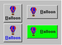
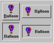
Specifies whether the image and label are displayed vertically or horizontally.
Specifies whether the image and label are displayed vertically or horizontally.
pressedGraphicsDescriptor: aGraphicsDescriptor
Specifies the graphics descriptor which draws on the face of the widget when it is pressed.
Specifies the graphics descriptor which draws on the face of the widget when it is pressed.
pressedLabelString: aString
Specifies the renderable object (string) which draws on the face of the widget when it is pressed.
Specifies the renderable object (string) which draws on the face of the widget when it is pressed.
showAsDefault: aBoolean
Specifies whether the PushButton should be visually marked as a default button.
Specifies whether the PushButton should be visually marked as a default button.
Clicked
These events are triggered when the button has been clicked. Buttons are clicked when the mouse is clicked and released within the button. Buttons may also be clicked via the space bar when the button has focus or via a carriage return when a button is a default button.
These events are triggered when the button has been clicked. Buttons are clicked when the mouse is clicked and released within the button. Buttons may also be clicked via the space bar when the button has focus or via a carriage return when a button is a default button.
Default Action Requested
These events are triggered when the widget is double clicked.
These events are triggered when the widget is double clicked.
checkedGraphicsDescriptor: aGraphicsDescriptor
Specifies the graphics descriptor which draws on the face of the widget when it is checked.
Specifies the graphics descriptor which draws on the face of the widget when it is checked.
checkedLabelString: aString
Specifies the renderable object (string) which draws on the face of the widget when it is checked.
Specifies the renderable object (string) which draws on the face of the widget when it is checked.
click
Programatically click the button.
Programatically click the button.
disabledGraphicsDescriptor: aGraphicsDescriptor
Specifies the graphics descriptor which draws on the face of the widget when it is disabled.
Specifies the graphics descriptor which draws on the face of the widget when it is disabled.
disabledLabelString: aString
Specifies the renderable object (string) which draws on the face of the widget when it is disabled.
Specifies the renderable object (string) which draws on the face of the widget when it is disabled.
drawPolicy: anInteger
Specifies the drawing policy used in rendering buttons. The drawing policy determines two things for a button:
Specifies the drawing policy used in rendering buttons. The drawing policy determines two things for a button:
graphicsDescriptor: aGraphicsDescriptor
Specifies the graphics descriptor which draws on the face of the widget.
Specifies the graphics descriptor which draws on the face of the widget.
orientation: anInteger
Specifies whether the image and label are displayed vertically or horizontally.
Specifies whether the image and label are displayed vertically or horizontally.
pressedGraphicsDescriptor: aGraphicsDescriptor
Specifies the graphics descriptor which draws on the face of the widget when it is pressed.
Specifies the graphics descriptor which draws on the face of the widget when it is pressed.
pressedLabelString: aString
Specifies the renderable object (string) which draws on the face of the widget when it is pressed.
Specifies the renderable object (string) which draws on the face of the widget when it is pressed.
selection: aBoolean
Displays the button in its selected state if set to true.
Displays the button in its selected state if set to true.
set
Set the receiver's state to on (true).
Set the receiver's state to on (true).
showAsDefault: aBoolean
Specifies whether the PushButton should be visually marked as a default button.
Specifies whether the PushButton should be visually marked as a default button.
Default Action Requested
These events are triggered when the widget is double clicked.
These events are triggered when the widget is double clicked.
Selection Changed
These events are triggered when the part’s value is changed.
These events are triggered when the part’s value is changed.


