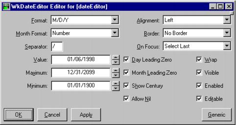
date
Answers the date held by the widget.
Answers the date held by the widget.
editable: aBoolean
Specifies whether a user can edit text in the entry field part of the spin button.
Specifies whether a user can edit text in the entry field part of the spin button.
wrap: aBoolean
Specifies whether the spin button should cycle or stop upon reaching the end of the collection, or max or min for a numeric spin button.
Specifies whether the spin button should cycle or stop upon reaching the end of the collection, or max or min for a numeric spin button.
Activate Callback
These callbacks are triggered when the user presses the default action key. This is typically a carriage return.
These callbacks are triggered when the user presses the default action key. This is typically a carriage return.
Decrement Callback
These callbacks are triggered when the user decreases the spin button value by one step. This can happen either when the down arrow key is pressed or when the down arrow button is selected with the mouse.
These callbacks are triggered when the user decreases the spin button value by one step. This can happen either when the down arrow key is pressed or when the down arrow button is selected with the mouse.
Focus Callback
These callbacks are triggered before the entry field has accepted input focus.
These callbacks are triggered before the entry field has accepted input focus.
Increment Callback
These callbacks are triggered when the user increases the spin button value by one step. This can happen either when the up arrow key is pressed or the up arrow button is selected with the mouse.
These callbacks are triggered when the user increases the spin button value by one step. This can happen either when the up arrow key is pressed or the up arrow button is selected with the mouse.
Losing Focus Callback
These callbacks are triggered before the entry field loses input focus.
These callbacks are triggered before the entry field loses input focus.
Modify Verify Callback
These callbacks are triggered before text is deleted from or inserted into the widget. This callback can be used to check a character value after it is entered by the user and before it is accepted by the control.
These callbacks are triggered before text is deleted from or inserted into the widget. This callback can be used to check a character value after it is entered by the user and before it is accepted by the control.
Value Changed Callback
These callbacks are triggered after text is deleted from or inserted into the widget. This callback can be used to retrieve the current value of the widget.
These callbacks are triggered after text is deleted from or inserted into the widget. This callback can be used to retrieve the current value of the widget.
Alignment
Specifies the text alignment used by the widget.
Specifies the text alignment used by the widget.
Allow Nil
Specifies whether the text field may have a blank (nil) value.
Specifies whether the text field may have a blank (nil) value.
Border Width
Specifies the width of the border that surrounds the widget’s window on all four sides. The width is specified in pixels. A width of zero means that no border will show.
Specifies the width of the border that surrounds the widget’s window on all four sides. The width is specified in pixels. A width of zero means that no border will show.
Day Leading Zero
Specifies whether the day field is displayed with a leading zero.
Specifies whether the day field is displayed with a leading zero.
Editable
Specifies whether a user can edit text in the entry field part of the spin button.
Specifies whether a user can edit text in the entry field part of the spin button.
Enabled
Determines whether a widget will react to input events. Disabled (insensitive) widgets do not react to input events.
Determines whether a widget will react to input events. Disabled (insensitive) widgets do not react to input events.
Format
Specifies format in which the date is displayed.
Specifies format in which the date is displayed.
Maximum
Specifies a numeric spin button’s maximum value.
Specifies a numeric spin button’s maximum value.
Minimum
Specifies a numeric spin button’s minimum value.
Specifies a numeric spin button’s minimum value.
Month Format
Specifies format in which the month is displayed.
Specifies format in which the month is displayed.
Month Leading Zero
Specifies whether the month field is displayed with a leading zero.
Specifies whether the month field is displayed with a leading zero.
On Focus
Specifies which field is selected on gaining focus.
Specifies which field is selected on gaining focus.
Separator
Specifies the separator character(s) used to separate the date fields.
Specifies the separator character(s) used to separate the date fields.
Show Century
Specifies whether the century is displayed or not.
Specifies whether the century is displayed or not.
Visible
Maps the widget (makes visible) as soon as it is both realized and managed, if set to True. If set to False, the client is responsible for mapping and unmapping the widget.
Maps the widget (makes visible) as soon as it is both realized and managed, if set to True. If set to False, the client is responsible for mapping and unmapping the widget.
Value
Specifies the initial value of the widget.
Specifies the initial value of the widget.
Wrap
Specifies whether the spin button should cycle or stop upon reaching the end of the collection, or max or min for a numeric spin button.
Specifies whether the spin button should cycle or stop upon reaching the end of the collection, or max or min for a numeric spin button.


