Chapter 17 UI Assistant Overview

Chapter 17 UI Assistant Overview
This chapter introduces you to VA Assist Pro’s UI Assistant. In this chapter you will
Starting the UI Assistant
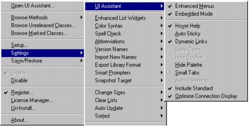
You will notice that the installation procedure has added a new menu item, VA Assist Pro, to the Transcript’s Tools menu.
To start the UI Assistant:
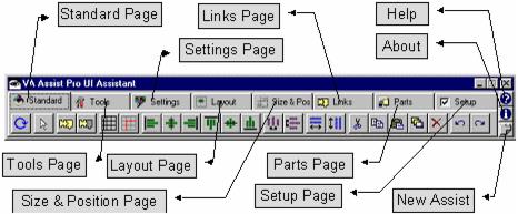
The UI Assistant screen appears, as shown on the next page:
Enabling and Disabling VA Assist Pro
If you would like to disable VA Assist Pro for any reason (so that it does not appear), execute the following in a workspace:
VisualAgeAssist disable
To re-enable VA Assist Pro, execute:
VisualAgeAssist enable
You may also use the Enable/Disable options off of the VA Assist Pro sub menu of the Transcript’s Tools menu.
Using the UI Assistant
In order to quickly familiarize yourself with some of the UI Assistant’s most useful features, we will go through a number of simple examples of how the UI Assistant can save you a great deal of time. For each example, we will specify a task, describe how you would accomplish the task using the Composition Editor and then show you how to do the same task quicker and easier with the UI Assistant.
Setting Attachments
One of the hardest and most time consuming procedures in the Composition Editor is the setting of attachments. Attachments specify how a widget will re-size itself when its parent form or window re-sizes. It is quite common, for example, to want to lock a group of buttons to the lower right corner of the screen or to lock the top and bottom of a listbox to the top and bottom of the screen so that it grows to fill the extra space as the window is made larger.
As an example, we will explore the steps necessary to lock a group of buttons (e.g., OK, Cancel and Apply) to the lower right corner of the window:
Setting Attachments without the UI Assistant
1.
2.
3.
4.
5.
6.
7.
8.
For a group of five widgets, it would take at least 35 mouse clicks to complete this task. For a window composed of several dozen widgets, it could take several hundred mouse clicks to set all of the attachments correctly.
Setting Attachments with the UI Assistant
1.
2.
3.
For a group of five widgets, it would take no more than seven mouse clicks - a clear five to one savings of effort. The more widgets on the page, the more dramatic the time-savings.
Setting Styles
Another common operation when laying out a window is the setting of styles for the various widgets. Using the Composition Editor, all style settings are accomplished via the Settings View for the widget. For setting the styles of one widget, this isn’t too bad. If you need to change the style for a number of widgets, this can be very time consuming and repetitive.
A common example is the need to left or right align labels on the screen. By default, the Composition Editor creates all new labels center aligned - which is almost never the appropriate choice. We will explore the steps required to right align a large number of labels in a single window:
Setting Label Alignment without the UI Assistant
1.
2.
3.
4.
5.
6.
For a screen full of dozens of labels and text fields, the above process would take many dozens of mouse clicks.
Setting Label Alignment with the UI Assistant
1.
2.
3.
4.
5.
For a window that contained just twenty-five labels, it would take well over a hundred mouse clicks without the UI Assistant. With the UI Assistant, it takes only four (or three if you happened to have the UI Assistant already open to the Settings page).
Setting Colors
As you can see, the UI Assistant makes it easy to change styles for a collection of widgets all at once. Changing styles need not be limited to homogeneous collections of widgets either. Another common problem is the need to change the background color for a number of widgets (or all of the widgets on the screen). The UI Assistant’s style settings tools can make this easier as well:
Setting Background Color without the UI Assistant
1.
2.
3.
4.
5.
6.
7.
For a large number of buttons, this can be a time consuming and repetitive operation.
Setting Background Color with the UI Assistant
1.
2.
3.
As you can see, the style comboboxes can be used with a heterogeneous collection of widgets. As you select a widget or collection of widgets, the UI Assistant will display the two most common attributes that the selected widgets all have in common. You can switch either combobox to display a different attribute by Right-clicking on it and selecting a new attribute type. The UI Assistant will automatically remember any attribute changes you make for the selected widget type.
The UI Assistant provides a number of ways to change widget colors in addition to the technique outlined above. In addition to the style comboboxes, you can also click the Color button on the UI Assistant Settings page to launch the standard Color selection window.
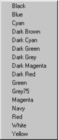
Right-clicking on the Color button will give you a popup list of common colors and allow you to bypass the Color selection window all together.
Setting Fonts
The UI Assistant makes setting fonts easier as well. With the Composition Editor, you are forced to select a font and then “paint” it onto each widget that should have that font. For a window full of widgets, this can be very time consuming.
The UI Assistant augments this process by allowing you to apply font changes to multiple widgets simultaneously. For example:
Setting Fonts the UI Assistant
1.
2.
3.
4.
Note that shift-clicking on the font button opens the Font selection dialog in the same manner as the Composition Editor “Options | Fonts...” command. Selecting a font will then allow you to paint the selected font onto one or more widgets.
Morphing
As a window design matures, additional space and functionality constraints may make it necessary to replace one widget type with another. If a widget participates in a number of connections and has lots of custom attribute settings, switching to a new widget type (either a similar type of widget or a subclass of the existing widget) can be a very painful and error prone task. You would need to delete the existing widget, create a new one in its place, and then re-create every connection and attribute setting. Not fun!
The UI Assistant provides a morphing function that makes it easy to swap one widget type for another. In general, any primitive widget (e.g., button, label, list, etc.) can be morphed into any other primitive type. Likewise, any composite widget (e.g., form, groupbox, etc.) can be morphed into any other composite type. Clicking on the Morph button (shown below) on the Settings page pops up a list of widget types similar to the source widget. Selecting a new widget type will then morph the selected widget (or widgets) into the new type.
Each connection and attribute is semantically validated during the morphing process to ensure that the parts remain valid. Connections that become invalid because the event, action or attribute does not exist in the target widget type are automatically removed. Attributes that the source and target widget types have in common are automatically migrated over. Attributes that no longer exist are dropped while new attributes are appropriately defaulted. The entire morphing process is logged to the Transcript so that you can note any attributes or connections that are lost. If you are unhappy with the morph, you can always undo the operation and be right back where you started.
Link Filtering
Visual programming is a very powerful technique for rapidly building user interfaces. It is also a technique for rapidly building interfaces that no one except the original developer can understand. The term “spaghetti code“ takes on new significance when staring at a screen covered by dozens if not hundreds of crisscrossing green and blue lines. The UI Assistant’s Links page dramatically improves this situation by allowing you to peel away layers of connections and focus in on just the ones you are interested in.
The UI Assistant gives you tools that allow you to look at any combination of event to action or attribute connections that you want. For an individual part, you can look at just the links that are associated with that part. As you click on different parts, the displayed connections are hidden and shown dynamically. You can further filter the displayed links by concentrating on just the event connections (incoming, outgoing or both), or just the attribute connections (using the buttons shown below).
You can even filter down to specific kinds of events (e.g., just clicked events or object attribute connections) using the link filter combobox shown below. After selecting the Event, Action, or Attribute radiobutton, you can select an event, action or attribute filter that will be applied to all toolbar button commands. The filter list is derived dynamically from the parts present in the Composition Editor. For example, you could select a clicked event filter. Clicking the Show All Connections button will then show all the clicked event links for all the parts. If the Dynamic Links setting is enabled, the Filter combobox can be used to quickly hide/show different combinations of connections. The last toolbar selection will be automatically applied as the filter is updated.