labelInsensitivePixmap: anImage
Specifies the renderable object (image) which draws on the face of the widget when it is disabled.
Specifies the renderable object (image) which draws on the face of the widget when it is disabled.
labelInsensitiveString: aString
Specifies the renderable object (string) which draws on the face of the widget when it is disabled.
Specifies the renderable object (string) which draws on the face of the widget when it is disabled.
Default Action Callback
These callbacks are triggered when the widget is double clicked.
These callbacks are triggered when the widget is double clicked.
Border Width
Specifies the width of the border that surrounds the widget’s window on all four sides. The width is specified in pixels. A width of zero means that no border will show.
Specifies the width of the border that surrounds the widget’s window on all four sides. The width is specified in pixels. A width of zero means that no border will show.
Enabled
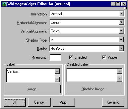
Determines whether a widget will react to input events. Disabled (insensitive) widgets do not react to input events.
Determines whether a widget will react to input events. Disabled (insensitive) widgets do not react to input events.
Horizontal Alignment
Specifies the horizontal alignment for the widget's image.
Specifies the horizontal alignment for the widget's image.
Label - Default
Specifies the default label string.
Specifies the default label string.
Label - Disabled
Specifies the label string when the widget is disabled.
Specifies the label string when the widget is disabled.
Image - Default
Specifies the default label image.
Specifies the default label image.
Image - Disabled
Specifies the label image when the widget is disabled.
Specifies the label image when the widget is disabled.
Mnemonic
Provides the user with alternate means for selecting a button.
Provides the user with alternate means for selecting a button.
Orientation
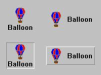
Specifies whether the image and label are displayed vertically or horizontally.
Specifies whether the image and label are displayed vertically or horizontally.
Shadow Type
Specifies the drawing style for the frame around the label.
Specifies the drawing style for the frame around the label.
Vertical Alignment
Specifies the vertical alignment for the widget's image.
Specifies the vertical alignment for the widget's image.
Visible
Maps the widget (makes visible) as soon as it is both realized and managed, if set to True. If set to False, the client is responsible for mapping and unmapping the widget.
Maps the widget (makes visible) as soon as it is both realized and managed, if set to True. If set to False, the client is responsible for mapping and unmapping the widget.


