Part Encyclopedia : WkCircularGaugeView

WkCircularGaugeView
The WkCircularGaugeView part provides a visual indication of a magnitude within a given range. It can be used to represent such values as the amount of gas left in a gas tank, or the remaining balance in a bank account. It is also often used to indicate the amount of time spent/remaining on a long compute-bound processing task, such as reading a file or sorting a list.
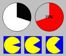
The gauges provided in WidgetKit/Controls can either be rectangular or circular. The rectangular versions, WkHorizontalBarGaugeView and WkVerticalBarGaugeView, show a rectangular bar to indicate the current value of the gauge (increasing to the right and upwards, respectively). The WkCircularGaugeView fills the wedge of a circle to indicate its value.
The direction of the progress sweep can be specified (clockwise or counterclockwise). The angle of the gauge’s completion indication is controlled by the start angle, value, minimum and maximum resources. The gauge’s progress indication is a color (pieColor resource). The uncompleted progress indication is a color (foregroundColor resource). A label can be drawn centered in the progress bar. This can either be a percentage complete (value / (max - min)), displayed automatically by the progress bar (howPercentage resource), or any defined renderable image as the label (image resource). The guage can be forced to be circular or drawn as an oval that fits its bounding box (mustBeCircle resource).
Protocol
direction: anInteger
Specifies the direction the pie is drawn.
Default: XmFORWARD (Forward/Clockwise)
Valid resource values:
XmFORWARD (Forward/Clockwise) - The pie is drawn clockwise.
XmREVERSE (Reverse/Counter Clockwise) - The pie is drawn counter clockwise.
 
graphicsDescriptor: aGraphicsDescriptor
Specifies the graphics descriptor which draws as the label of the gauge. The label is displayed only if the showPercentage resource value is false. Note that the image label is drawn twice, in the foreground and background colors, so that the label appears ‘reversed’ over the actual foreground and background colors of the progress bar. If a ribbon image is being used, then the label is drawn once, using the foreground color.
 
maximum: anInteger
Specifies the gauge's maximum value.
 
minimum: anInteger
Specifies the gauge's minimum value.
 
mustBeCircle: aBoolean
Specifies whether the gauge should be forced to be circular (default is oval).
 
pieColor: aString
Specifies the color of the pie.
 
shadowType: anInteger
Specifies the drawing style for the frame around the progress bar widget.
Default: XmSHADOWIN (Shadow In)
Valid resource values:
XmSHADOWNONE (Shadow None) - No frame is drawn.
XmSHADOWIN (Shadow In) - Draws a frame such that it appears inset. This means that the bottom shadow visuals and top shadow visuals are reversed.
XmSHADOWOUT (Shadow Out) - Draws a frame such that it appears outset.
 
shadowWidth: anInteger
Specifies the width for the border
 
showPercentage: aBoolean
Specifies the whether a label showing the percentage completed is shown in the progress bar. If true, then the string ‘X %’ is show in the progress bar, where X is the percentage of progress completed. If false, then no percentage label is shown.
 
startAngle: anInteger
Specifies the starting angle of the gauge in degrees (90 is the default).
 
value: anInteger
Specifies the gauge's position between minimum and maximum.