drawPolicy: anInteger
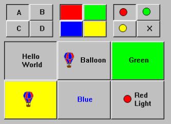
Specifies the drawing policy used in rendering buttons on the valueset. The drawing policy determines two things for a button:
Specifies the drawing policy used in rendering buttons on the valueset. The drawing policy determines two things for a button:
numColumns: anInteger
Specifies the number of columns that are made to accommodate the receiver’s buttons. This attribute always sets the x-axis dimension.
Specifies the number of columns that are made to accommodate the receiver’s buttons. This attribute always sets the x-axis dimension.
numRows: anInteger
Specifies the number of rows that are made to accommodate the receiver's buttons. This attribute always sets the y-axis dimension.
Specifies the number of rows that are made to accommodate the receiver's buttons. This attribute always sets the y-axis dimension.
Default Action Callback
These callbacks are triggered when the widget is double clicked.
These callbacks are triggered when the widget is double clicked.
Border Width
Specifies the width of the border that surrounds the widget’s window on all four sides. The width is specified in pixels. A width of zero means that no border will show.
Specifies the width of the border that surrounds the widget’s window on all four sides. The width is specified in pixels. A width of zero means that no border will show.
Enabled
Determines whether a widget will react to input events. Disabled (insensitive) widgets do not react to input events.
Determines whether a widget will react to input events. Disabled (insensitive) widgets do not react to input events.
Draw Policy
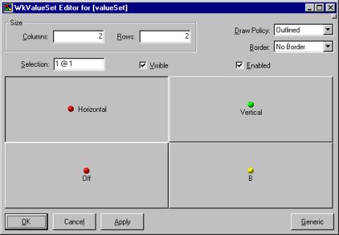
Specifies the drawing policy used in rendering buttons on the valueset. The drawing policy determines two things for a button:
Specifies the drawing policy used in rendering buttons on the valueset. The drawing policy determines two things for a button:
Num Columns
Specifies the number of columns that are made to accommodate the receiver’s buttons. This attribute always sets the x-axis dimension.
Specifies the number of columns that are made to accommodate the receiver’s buttons. This attribute always sets the x-axis dimension.
Num Rows
Specifies the number of rows that are made to accommodate the receiver's buttons. This attribute always sets the y-axis dimension.
Specifies the number of rows that are made to accommodate the receiver's buttons. This attribute always sets the y-axis dimension.
Selection
Specifies the widget's initial selection.
Specifies the widget's initial selection.
Visible
Maps the widget (makes visible) as soon as it is both realized and managed, if set to True. If set to False, the client is responsible for mapping and unmapping the widget.
Maps the widget (makes visible) as soon as it is both realized and managed, if set to True. If set to False, the client is responsible for mapping and unmapping the widget.
Background Color
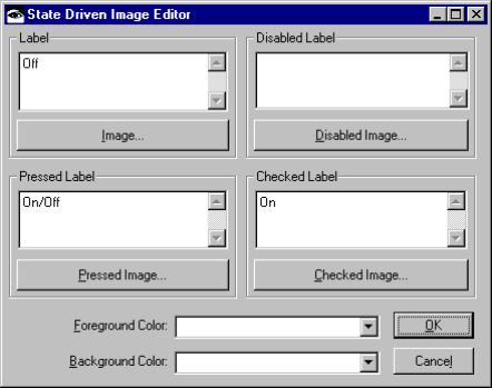
Specifies the background color for the cell.
Specifies the background color for the cell.
Foreground Color
Specifies the foreground color for the cell.
Specifies the foreground color for the cell.
Label - Default
Specifies the default label string.
Specifies the default label string.
Label - Pressed
Specifies the label string when the widget is pressed.
Specifies the label string when the widget is pressed.
Label - Disabled
Specifies the label string when the widget is disabled.
Specifies the label string when the widget is disabled.
Label - Checked
Specifies the label string when the widget is checked.
Specifies the label string when the widget is checked.
Image - Default
Specifies the default label image.
Specifies the default label image.
Image - Pressed
Specifies the label image when the widget is pressed.
Specifies the label image when the widget is pressed.
Image - Disabled
Specifies the label image when the widget is disabled.
Specifies the label image when the widget is disabled.
Image - Checked
Specifies the label image when the widget is checked.
Specifies the label image when the widget is checked.


