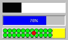
graphicsDescriptor: aGraphicsDescriptor
Specifies the graphics descriptor which draws as the label of the progress bar. The label is displayed only if the showPercentage resource value is false. Note that the image label is drawn twice, in the foreground and background colors, so that the label appears ‘reversed’ over the actual foreground and background colors of the progress bar. If a ribbon image is being used, then the label is drawn once, using the foreground color.
Specifies the graphics descriptor which draws as the label of the progress bar. The label is displayed only if the showPercentage resource value is false. Note that the image label is drawn twice, in the foreground and background colors, so that the label appears ‘reversed’ over the actual foreground and background colors of the progress bar. If a ribbon image is being used, then the label is drawn once, using the foreground color.
ribbonGraphicsDescriptor: aGraphicsDescriptor
Specifies the graphics descriptor which draws as the completed ribbon of the progress bar. This object is drawn instead of a color strip. Note that when a ribbon image is used, a label (the showPercentage or image resources) will be drawn using the imageColor resource, or if that is nil, the foregroundColor resource.
Specifies the graphics descriptor which draws as the completed ribbon of the progress bar. This object is drawn instead of a color strip. Note that when a ribbon image is used, a label (the showPercentage or image resources) will be drawn using the imageColor resource, or if that is nil, the foregroundColor resource.
showPercentage: aBoolean
Specifies the whether a label showing the percentage completed is shown in the progress bar. If true, then the string ‘X %’ is show in the progress bar, where X is the percentage of progress completed. If false, then no percentage label is shown.
Specifies the whether a label showing the percentage completed is shown in the progress bar. If true, then the string ‘X %’ is show in the progress bar, where X is the percentage of progress completed. If false, then no percentage label is shown.
tickSize: anInteger
Specifies the gauge's tick size. Only valid when the gaugeStyle is set to step. If the value is set to zero, the widget will use the default setting (determined by the size of the widget).
Specifies the gauge's tick size. Only valid when the gaugeStyle is set to step. If the value is set to zero, the widget will use the default setting (determined by the size of the widget).

