fractionComplete: anInteger
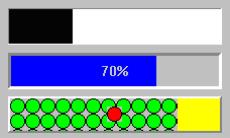
Specifies the current amount of progress to show in the progress bar. This resource is a fraction, denoting a number between 0 and 1. For example, 1/10 specifies 10 % complete. 1 represents 100 % complete.
Specifies the current amount of progress to show in the progress bar. This resource is a fraction, denoting a number between 0 and 1. For example, 1/10 specifies 10 % complete. 1 represents 100 % complete.
image: aPixmap
Specifies the renderable object which draws as the label of the progress bar. The label is displayed only if the showPercentage resource value is false. Note that the image label is drawn twice, in the foreground and background colors, so that the label appears ‘reversed’ over the actual foreground and background colors of the progress bar. If a ribbon image is being used, then the label is drawn once, using the foreground color.
Specifies the renderable object which draws as the label of the progress bar. The label is displayed only if the showPercentage resource value is false. Note that the image label is drawn twice, in the foreground and background colors, so that the label appears ‘reversed’ over the actual foreground and background colors of the progress bar. If a ribbon image is being used, then the label is drawn once, using the foreground color.
imageColor: aCgRGBColor
Specifies the color of the label drawn according to the image resource, or the color of the percentage complete label, according to the showPercentage resource. If the resource value is nil, then the label is drawn in reverse color over the colors of the progress bar (foreground color) and the background color.
Specifies the color of the label drawn according to the image resource, or the color of the percentage complete label, according to the showPercentage resource. If the resource value is nil, then the label is drawn in reverse color over the colors of the progress bar (foreground color) and the background color.
ribbonImage: aPixmap
Specifies the renderable object which draws as the completed ribbon of the progress bar. This object is drawn instead of a color strip. Note that when a ribbon image is used, a label (the showPercentage or image resources) will be drawn using the imageColor resource, or if that is nil, the foregroundColor resource.
Specifies the renderable object which draws as the completed ribbon of the progress bar. This object is drawn instead of a color strip. Note that when a ribbon image is used, a label (the showPercentage or image resources) will be drawn using the imageColor resource, or if that is nil, the foregroundColor resource.
setValue: anInteger
Sets the gauge's position between minimum and maximum and triggers the value changed callback.
Sets the gauge's position between minimum and maximum and triggers the value changed callback.
showPercentage: aBoolean
Specifies the whether a label showing the percentage completed is shown in the progress bar. If true, then the string ‘X %’ is show in the progress bar, where X is the percentage of progress completed. If false, then no percentage label is shown.
Specifies the whether a label showing the percentage completed is shown in the progress bar. If true, then the string ‘X %’ is show in the progress bar, where X is the percentage of progress completed. If false, then no percentage label is shown.
tickSize: anInteger
Specifies the gauge's tick size. Only valid when the gaugeStyle is set to step. If the value is set to zero, the widget will use the default setting (determined by the size of the widget).
Specifies the gauge's tick size. Only valid when the gaugeStyle is set to step. If the value is set to zero, the widget will use the default setting (determined by the size of the widget).
Value Changed Callback
These callbacks are triggered after widget’s value has been changed.
These callbacks are triggered after widget’s value has been changed.
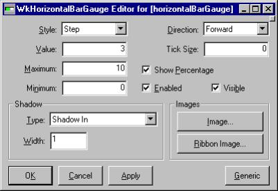
Enabled
Determines whether a widget will react to input events. Disabled (insensitive) widgets do not react to input events.
Determines whether a widget will react to input events. Disabled (insensitive) widgets do not react to input events.
Direction
Specifies the direction the progress bar moves in.
Specifies the direction the progress bar moves in.
Image
Specifies the renderable object which draws as the label of the progress bar. The label is displayed only if the showPercentage resource value is false. Note that the image label is drawn twice, in the foreground and background colors, so that the label appears ‘reversed’ over the actual foreground and background colors of the progress bar. If a ribbon image is being used, then the label is drawn once, using the foreground color.
Specifies the renderable object which draws as the label of the progress bar. The label is displayed only if the showPercentage resource value is false. Note that the image label is drawn twice, in the foreground and background colors, so that the label appears ‘reversed’ over the actual foreground and background colors of the progress bar. If a ribbon image is being used, then the label is drawn once, using the foreground color.
Maximum
Specifies the gauge's maximum value.
Specifies the gauge's maximum value.
Minimum
Specifies the gauge's minimum value.
Specifies the gauge's minimum value.
Ribbon Image
Specifies the renderable object which draws as the completed ribbon of the progress bar. This object is drawn instead of a color strip. Note that when a ribbon image is used, a label (the showPercentage or image resources) will be drawn using the imageColor resource, or if that is nil, the foregroundColor resource.
Specifies the renderable object which draws as the completed ribbon of the progress bar. This object is drawn instead of a color strip. Note that when a ribbon image is used, a label (the showPercentage or image resources) will be drawn using the imageColor resource, or if that is nil, the foregroundColor resource.
Shadow Type
Specifies the drawing style for the frame around the progress bar widget.
Specifies the drawing style for the frame around the progress bar widget.
Shadow Width
Specifies the width for the border
Specifies the width for the border
Show Percentage
Specifies the whether a label showing the percentage completed is shown in the progress bar. If true, then the string ‘X %’ is show in the progress bar, where X is the percentage of progress completed. If false, then no percentage label is shown.
Specifies the whether a label showing the percentage completed is shown in the progress bar. If true, then the string ‘X %’ is show in the progress bar, where X is the percentage of progress completed. If false, then no percentage label is shown.
Style
Specifies the gauge's gauge style.
Specifies the gauge's gauge style.
Tick Size
Specifies the gauge's tick size. Only valid when the gaugeStyle is set to step. If the value is set to zero, the widget will use the default setting (determined by the size of the widget).
Specifies the gauge's tick size. Only valid when the gaugeStyle is set to step. If the value is set to zero, the widget will use the default setting (determined by the size of the widget).
Value
Specifies the slider current position along the scale, between minimum and maximum.
Specifies the slider current position along the scale, between minimum and maximum.
Visible
Maps the widget (makes visible) as soon as it is both realized and managed, if set to True. If set to False, the client is responsible for mapping and unmapping the widget.
Maps the widget (makes visible) as soon as it is both realized and managed, if set to True. If set to False, the client is responsible for mapping and unmapping the widget.


