WkImageToggleButtonView


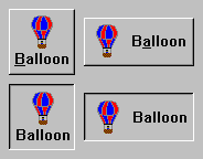
WkImageToggleButtonViews have two states: on, and off. They trigger a selectionChanged event when their state changes. Image toggle buttons may have an image and/or text string for a label. The image and text labels may be layed out either vertically or horizontally. Different images and labels can be specified for the up state, the pressed state, the checked state and the disabled state.
Protocol
alignment: resourceValue
Sets the horizontal alignment for the widget's image.
Sets the horizontal alignment for the widget's image.
Default: XmALIGNMENTBEGINNING (Left)
Valid resource values:
XmALIGNMENTBEGINNING (Left) - Causes the center of the image to be horizontally aligned with the left edge of the widget's window.
XmALIGNMENTCENTER (Center) - Causes the center of the image to be horizontally aligned in the center of the widget's window.
XmALIGNMENTEND (Right) - Causes the center of the image to be horizontally aligned with the right edge of the widget's window.
checkedGraphicsDescriptor: aGraphicsDescriptor
Specifies the graphics descriptor which draws on the face of the widget when it is checked.
Specifies the graphics descriptor which draws on the face of the widget when it is checked.
checkedLabelString: aString
Specifies the renderable object (string) which draws on the face of the widget when it is checked.
Specifies the renderable object (string) which draws on the face of the widget when it is checked.
click
Programatically click the button.
Programatically click the button.
disabledGraphicsDescriptor: aGraphicsDescriptor
Specifies the graphics descriptor which draws on the face of the widget when it is disabled.
Specifies the graphics descriptor which draws on the face of the widget when it is disabled.
disabledLabelString: aString
Specifies the renderable object (string) which draws on the face of the widget when it is disabled.
Specifies the renderable object (string) which draws on the face of the widget when it is disabled.
drawPolicy: anInteger
Specifies the drawing policy used in rendering buttons. The drawing policy determines two things for a button:
Specifies the drawing policy used in rendering buttons. The drawing policy determines two things for a button:
1. how the button draws itself so it looks like a button;
2. how the button animates when pressed.
2. how the button animates when pressed.
Default: XmFLATDRAWPOLICY (Flat)
Valid resource values:
XmSHADOWEDTWOSTATEDRAWPOLICY (Shadowed Two State) - Buttons are drawn with a 3D shadowed outline and exhibit a simple 2-state (OFF and ON) state rendering.
XmSHADOWEDTHREESTATEDRAWPOLICY (Shadowed Three State) - Buttons are drawn with a 3D shadowed outline and exhibit a 3-state (OFF, ON, and PRESSED) state rendering.
XmOUTLINEDRAWPOLICY (Outlined) - Buttons are drawn with a simple etched (non-shadowed) outline and exhibit a 2-state (OFF and ON) state rendering.
XmFLATDRAWPOLICY (Flat) - Buttons are drawn flat without a 3D shadow.
indicatorType: anInteger
Specifies if the indicator is a 1-of or N-of indicator.
Specifies if the indicator is a 1-of or N-of indicator.
Default: XmNOFMANY (N-of-Many)
Valid resource values:
XmNOFMANY (N-of-Many) - Causes the ToggleButton to act like a CheckBox
XmONEOFMANY (1-of-Many) - Causes the ToggleButton to act like a RadioButton
graphicsDescriptor: aGraphicsDescriptor
Specifies the graphics descriptor which draws on the face of the widget.
Specifies the graphics descriptor which draws on the face of the widget.
labelString: aString
Specifies the renderable object (string) which draws on the face of the widget.
Specifies the renderable object (string) which draws on the face of the widget.
mnemonic: aCharacter
Provides the user with alternate means for selecting a button.
Provides the user with alternate means for selecting a button.
orientation: anInteger
Specifies whether the image and label are displayed vertically or horizontally.
Specifies whether the image and label are displayed vertically or horizontally.
Default: XmHORIZONTAL (Horizontal)
Valid resource values:
XmVERTICAL (Vertical) - Displays the image and label vertically.
XmHORIZONTAL (Horizontal) - Displays the image and label horizontally.
pressedGraphicsDescriptor: aGraphicsDescriptor
Specifies the graphics descriptor which draws on the face of the widget when it is pressed.
Specifies the graphics descriptor which draws on the face of the widget when it is pressed.
pressedLabelString: aString
Specifies the renderable object (string) which draws on the face of the widget when it is pressed.
Specifies the renderable object (string) which draws on the face of the widget when it is pressed.
selection: aBoolean
Displays the button in its selected state if set to true.
Displays the button in its selected state if set to true.
set
Set the receiver's state to on (true).
Set the receiver's state to on (true).
showAsDefault: aBoolean
Specifies whether the PushButton should be visually marked as a default button.
Specifies whether the PushButton should be visually marked as a default button.
verticalAlignment: anInteger
Specifies the vertical alignment for the widget's image.
Specifies the vertical alignment for the widget's image.
Default: XmALIGNMENTCENTER (Center)
Valid resource values:
XmALIGNMENTCENTER (Center) - Causes the center of the image to be vertically aligned in the center of the widget's window.
XmALIGNMENTTOP (Top) - Causes the top edge of the image to be vertically aligned with the top edge of the widget's window.
XmALIGNMENTBOTTOM (Bottom) - Causes the center of the image to be vertically aligned in the center of the widget's window.
Events
Default Action Requested
These events are triggered when the widget is double clicked.
These events are triggered when the widget is double clicked.
Selection Changed
These events are triggered when the part’s value is changed.
These events are triggered when the part’s value is changed.
Last modified date: 11/19/2018